
ROBERT LYNCH
boomsatsuma
MEDIA STUDENT
Unit 32 Graphic Design For Media Products
Enjoy Paradise Until The Tide Turns - Shepard Fairey
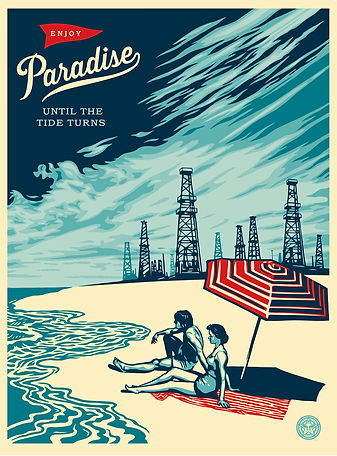

“Enjoy Paradise Until The Tide Turns”
This is a image was created by a 45 American graffiti artist and skateboarder from South Carolina in America who also was the founder of the OBEY logo Shepard Fairey.
Purpose: To instill a heavy weighted message about the realism of global warming, urbanisation and globalisation. To get people to acknowledge the problem of our ever expanding need of recourses to sustain our ever growing population. Its as if Shepard Fairey is warning us saying if we continue down this path of consumption we are going to destroy many things, including any place we consider a Paradise.
Format: The format consists of two key sections of the image. The first is two people on a beach relaxing, this is the idea of “Paradise”. In the distance there are some pylons, power generators and oil rigs as well as an enraged sky. This could be used to represent our ever growing need for recourse to sustain our huge population and how it effects the world around us.
Content: The content consists of two people relaxing on a beach to represent “Paradise” everything seems perfect, then in the distance the the sky turns sinister, scorched and scarred there is also a multitude of pylons, power generators and oil rigs. The two people on the beach relaxing together creates a connection to the beholder as most of us like the idea of relaxing on a beach with someone we care about. The disturbance of urbanisation/globalisation in the distance is put in place to threaten our idea of “Paradise” in order to create a reaction out of us enforcing our need to protect and conserve our lands and not just use them as a resource to full our race.
As for the title it is simply a warning that if we continue of this path out need for recourses will steam roll all aspects of “Paradise”. “Enjoy Paradise Until The Tide Turns”.
Style: The style of the image is very much like a hybrid of American cold war propaganda, English WW1 propaganda and Cuban revolution propaganda. This is well fitted as for all intensive purposes this image is propaganda, it is a call to arms to fight against ‘The terror of consumption’.
Layout: The layout is creative as the page is split into one quarter “Paradise” and three quarter pylons, power stations and oil rigs (Urban and Globalisation). This in my eyes is to show the overwhelming rate in which we are manufacturing these stations that harvest resources at extreme rates to sustain our population and economy.
Target audience: The target audience for this image would be fans of Shepard Fairey who enjoy his work. Narrow that down, it could be the left wing society in Shepard Fairey’s fan base. That can then be broadened to left wing thinkers in general who care about the state of the planet and like seeing work that highlights and illustrates problems it faces.
Regulatory bodies: The main regulatory body that would regulate this image would be the FCC as they are the main regulatory body in the United States that filters what people in America see through, TV, Broadband, Radio and other media outlets.
Russell Brand's Messiah Complex Tour Art


Russell Brands Messiah Complex tour and Trews youtube channel.
This image was created to advertise Russell Brand's comedy tour The Messiah Complex and to use as a staple image on his youtube channel the Trews.
Purpose: To promote Russell Brand's Messiah Complex Tour and his Trews youtube channel. The image with the whole Che Guevara crossed with Jesus Christ theme and the ecklass promoting Christianity, Judaism, Muslim, Hinduism, Mc’Donalds and the Mars symbol are to share his ideological beliefs through imagery.
Format: The image is formated to highlight what the Messiah Complex tour will contain, through his half Che Guevara and jesus Christ along with his fancy necklass containing religeous and everyday symbols we can tell he is going to be sharing his ideological views to his fans and anyone else who would like to listen.
Content: The content consists of Russell Brand's head and his neckless. Russell Brand's face is in the image purely because the show is all about him so he wants to get his image out there. The neckless, though placed low on the image catches the eyes as much as Russell him self.
Style: The style of the image is very similar to the famous Che Guevara revolution poster that was moulded after Che in the Cuban revolution. This image with is bold style really catches the revolutionary spirit, the colours and shades stand stong in defience.
Layout: The layout of this image is simple yet powerful, the colours and shade real bounce and pop of each other to make a vibrant piece that captures the eyes of the beholder. The layout is simple and clear to understand. Russell's head is plastered across the image backround with a necklass around his neck containing religeous and cultural symbols.
Target audience: The target audience for this image would be fans of Russell who want to hear his ideological (or everyday) thoughts. Narrowed down Russell may be targeting his fans that have minds for moulding in order to get his thoughts across.
Regulatory bodies: A regulatory body that could regulate this image is the ASA which stands for Advertising Standards Authority which is the UK's independant regulator for advertising across all media.
Conceptual Graphic Design Ideas
#1


Concept 1: This concept was inspired by Paula Scher's work. It is my most flamboyant concept.
Purpose: The purpose of this concept is to stand out amongst other cards, posters, flyers promoting courses for young students and to capture their attention early and give them a taste of the creative flare that comes out of boomsatsuma.
Format: There is not a solid format to this concept it is just meant to be unique bizarre and fun looking. The main formating is surrounding a fellow student with words that are synonymous to the boomsatsuma course. The words are also coloured to fit the branding of boomsatsuma.
Content: The content of this image is Alon Farrow a Student on the boomsatsuma media course, Alon agreed to be the main focus of this image. Around Alon are words that me and Alon both believe are synonymous with the boomsatsuma course. In the top left corner is a boomsatsuma logo, the rest of the words on the page followed the boomsatsuma colour scheme for branding purposes.
Style: The style for this image takes after some of Paula Scher's work and is very differant compared to other concept arts used to help young students decide what courses they want to join after GCSE's. The layout of the words is meant to express the creative side of the boomsatsuma media course. The colours for the words follow the colour scheme of boomsatsuma.
Layout: The layout of the image is like our solar system, Alon is the centre of the concept with the words that relate to the boomsatsuma media course revolve around him. The layout is inspired by Paula Scher and is meant to look flamboyant compared to other concept peices used for young students to decide what course's they would like to join after GCSE's. The layout has be designed to look a bit out there, bold and brave highlighting the freedom and skill set boomsatsuma can give you.
Target audience: The target audience for this concept piece would students who have just finished GCSE's and are looking for a course to join. More specifically the target audience would be students interested in media based work and explorative learning.


#2
Concept 2: This concept was more aimed towards being an average concept art with a boomsatsuma flare to it.
Purpose: The purpose of this concept was to entice students to the boomsatsuma media course by showcasing some of the things students of the course have already done. To show teenagers who want to follow a path in media or just want a new course to join that boomsatsuma is here and can give you a very promising future, while you learn and have fun at the same time.
Format: The concept is formated with the activities that boomsatsuma students have been involved with at the top of the page and information about the course at the bottom. The images at the top are put in place to show what kinds of things you can be involved with at boomsatsuma. The information is placed below the images so when people are done looking at what the course can offer they can straight away get in contact with a school that has a boomsatsuma course.
Content: The content of this concept consists of the boomsatsuma logo in the top left corner followed by 5 images and two blocks of text. The logo is in the concept because this is to promote the boomsatsuma media course so it needs it's branding on it. The 5 images are activities students of the boomsatsuma media course have been involved with. The image at the top is the most recent. The spoken word artist and rapper B dolan visited our school and did a talk in front of our class for the year 13's spoken word project. Year 12's also attended and a handful of students helped film a show of his. This gave the year 12's at the time a good idea of what the course can offer. The last 4 images are of the year 13 class's trip to Copenhagen to promote green Bristol when they were year 12's. This was an excellent project that the students got involved with, they work alongside TV crews and the mayor of Bristol.
Style: This concept has no stand out style, it was designed to be a formal yet relaxed look at what the boomsatsuma course is and offers.
Layout: The content of the image is laid out in a simple clean manner first of all showing what students of the boomsatsuma media course have been getting involved with and what other students looking for a course can get involved with. The text boxes beneath the images contain contact information for boomsatsuma courses and a little message for students thinking about joining the course.
Target audience: The target audience are students looking to start a new course after GCSE's. More specifically students who are looking to have an education with a media background. Not only are we looking for students who want to do media work we are also looking for students who want to do work they will feel passionate about.
#3

Concept 3: This concept has more of a less is more approach, not being afraid of using the white and not over loading the page.
Purpose: The purpose of this concept is to use as little as possible on paper yet make a clear impression and leave a statment on what the boomsatsuma media course is like. To show students who have finished their GCSE's that the boomsatsuma media course is an excellent choice to make in terms of making a future for them selves.
Format: The concept format is layed out in a clear simple manner starting with the boomsatsuma logo in the top left corner of the concept for branding purposes. Next is spoken word artist and rapper B dolan who came and visited our school. Beneath that is contact information and other general information on the boomsatsuma course.
Content: The content as listed above is the boomsatsuma logo for branding purposes, spoken word artist and rapper B dolan as well as some of the year 12 and 13 class. Beneath that is basic information on the boomsatsuma course and how people can get involved in it.
Style: The style to this concept was to not be afraid of using the white of the page, using a small amount of imagery and text to contrast of the white.
Layout: This concept is the same as the second cencept in terms of layout, they both share imagery t the top of the page then informational text at the bottom such as contact details and more.
Target audience: The target audience for this concept are school students who are planning on joining a course after their GCSE's. The main target audience are school students who have a passion or desire to join and learn about the world of meadia, all asprects.
Final piece ideas
#1

Final Concept 1; This is my first concept of my final 3, it is similar to my second draft just with a more professional finish to it.
Purpose: As a poster the intended purpose of this piece is to be shown in schools up on walls or in advice/careers counsellors. The purpose of the posters content is to show students there is a fun, new, creative and professional course they can join after GCSE's that they might not have considered. To fulfill this purpose I have added an explanation at the top of the poster with relevant information about the course as well as contact information. For images I have added a wide range of images taken from projects and events that myself and other students have been involved in, this again is to give a genuine look at the course.
Format: The way this poster is formated is a simple, clean, fresh format. Utilizing blank space while having enough informative writing for the poster to be helpful and enough relevant images to be visually pleasing.
Content: This poster contains relevant information to the course as well as slightly more informal text. As well as that it contains contact information as students or parents need to know how to get in contact with the course leaders. The poster also contains images taken from past boomsatsuma events and projects.
Style: If I had to compare my design choice to anything it would be Vice's designs for their website as well as marketing and promotional pieces. They use a lot of whitespace to make their content feel very spacious and not claustrophobic, this is good as when a website or piece of work is crammed together not purposely it can make the reader or consumer in general very anxious to proceed.
Layout: The poster is laid out in 4 separate parts, there is the top with the main heading of the poster followed by information,then there is images which break the piece up, followed by contact information then images at the bottom acting as a footer.
Target Audience: The target for my poster is 16-17 year olds who are finishing their GCSEs and are starting to look at course they can join when they graduate. As well as this I want to have parents in mind when considering target audiences as some students may feel better about showing their parents the course first.
#2

This is my second final draft, the inspiration for this banner was the banners around our classroom which promote boomsatsuma, they're very loud vibrant and fun which is why I wanted to design one.
#3

This is my third concept piece, the postcard, this piece takes a simple approach, it's covered yet feels very open and easy to look at and take in the information required.
This is the schedule we will be working with for the assignment, the first date is 7/9/15. This was the day we were giving the brief that would entail all the information needed about the project.

This is the budget for the printing costs, depending on the amount needed to print. The costs are only the costs for postcards, posters and banners. We used an online printing agency to get the prices for printing this kind of product in large or small amounts.

Relevant Legal and Ethical Considerations
Relevant legal issues: The first thing I considered when thinking of legal issues was misleading or deceptive content that may reflect badly on boomsatsuma as a company and lead to further issues for example having incorrect or fake information on the postcards, posters and banners in order to further boomsatsuma as a company and attract more people to the course. Another big legal consideration would be branding as the misuse or even use of unwarranted branding could lead to negative legal proceedings such as a law suit. Finally there must not be any racial and or other discrimination, bigotry or hate shown on these pieces. What goes on these pieces must be considered carefully as they will be accessible to the public.
Relevant Ethical Considerations: A glaring ethical consideration is not misleading potential students of the course. We want to be as honest as possible and by that I mean explaining to them exactly what we can offer them and not exaggerating what they can get out of the course. We also don't want any rude language or imagery on the pieces as they are again aimed at potential students mainly being 16 years of age.